Search Navigation — imagem de capa

Conta Azul · 2024

Making the ERP navigable from the first access with a global search layer

  • Architecture
  • Navigation
  • Discoverability
  • MVP
  • Platform
Context
The ERP menu showed everything to everyone, with no hierarchy adapted to the user's stage. The result was cognitive overload, especially for first-time users who needed to find specific actions without knowing the product's structure.
Problem
Feature discovery depended entirely on trial-and-error exploration. There was no search layer that let the user reach directly what they needed (an action, feature or entity) without navigating the menu tree.
Approach
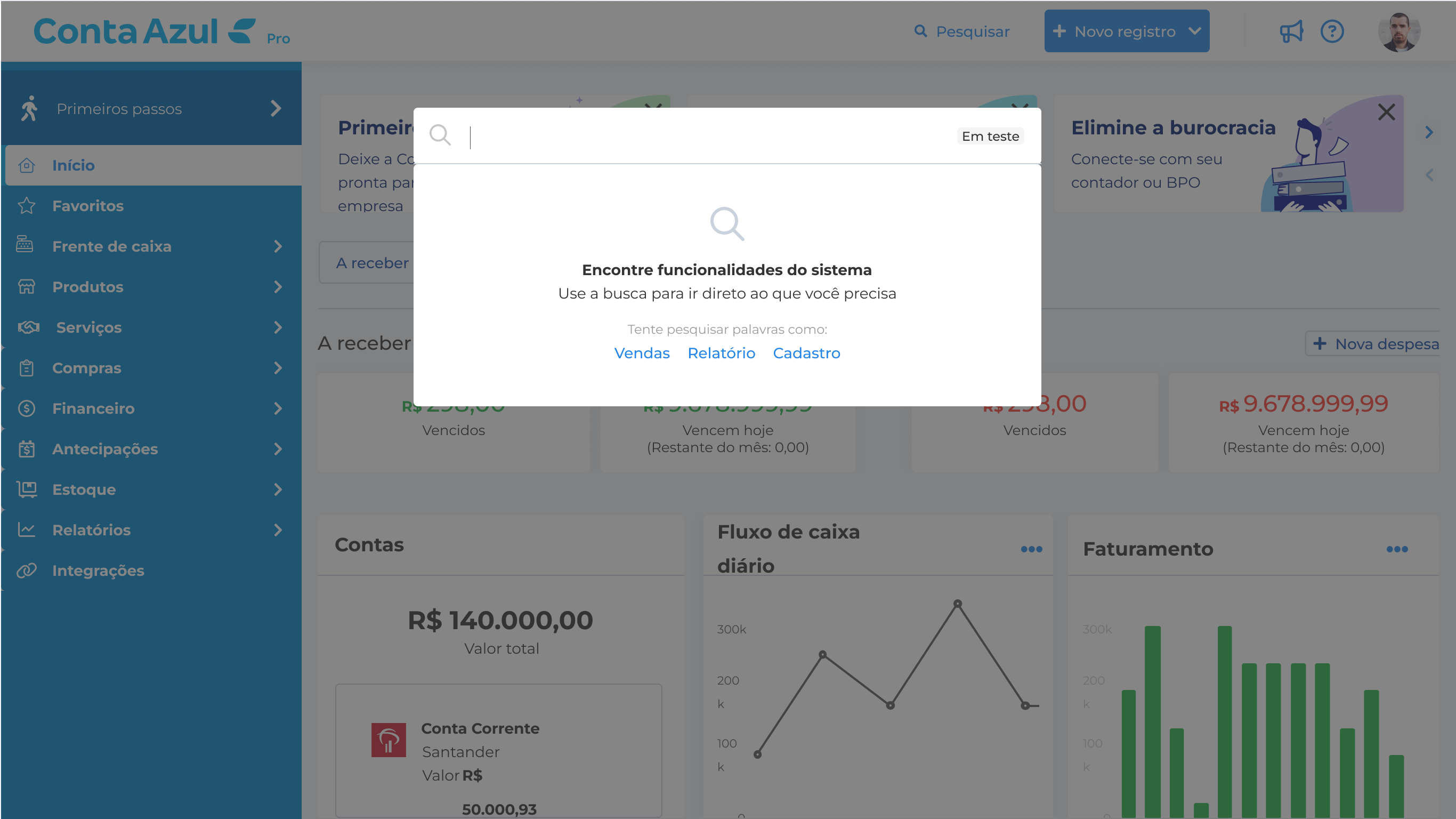
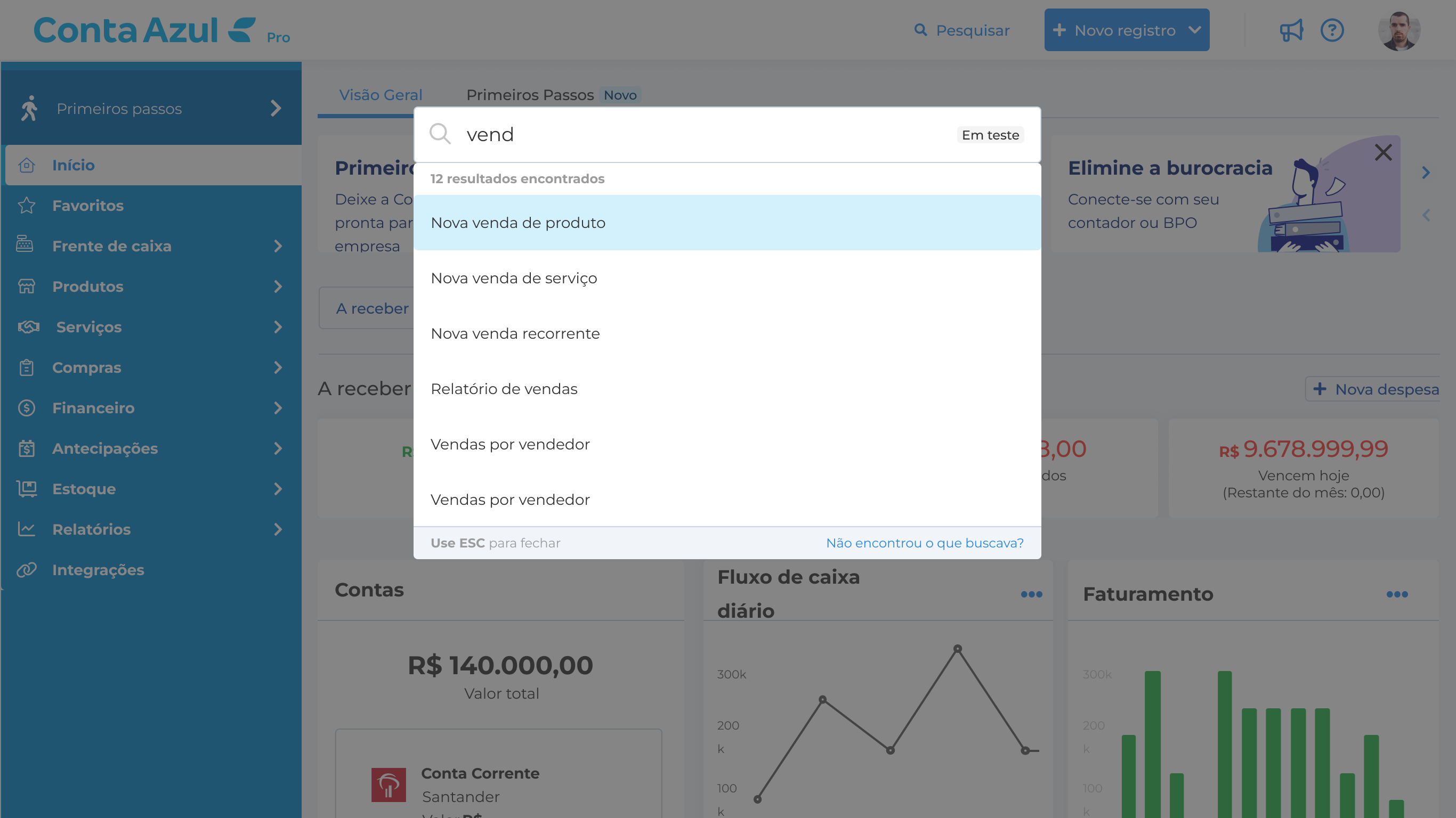
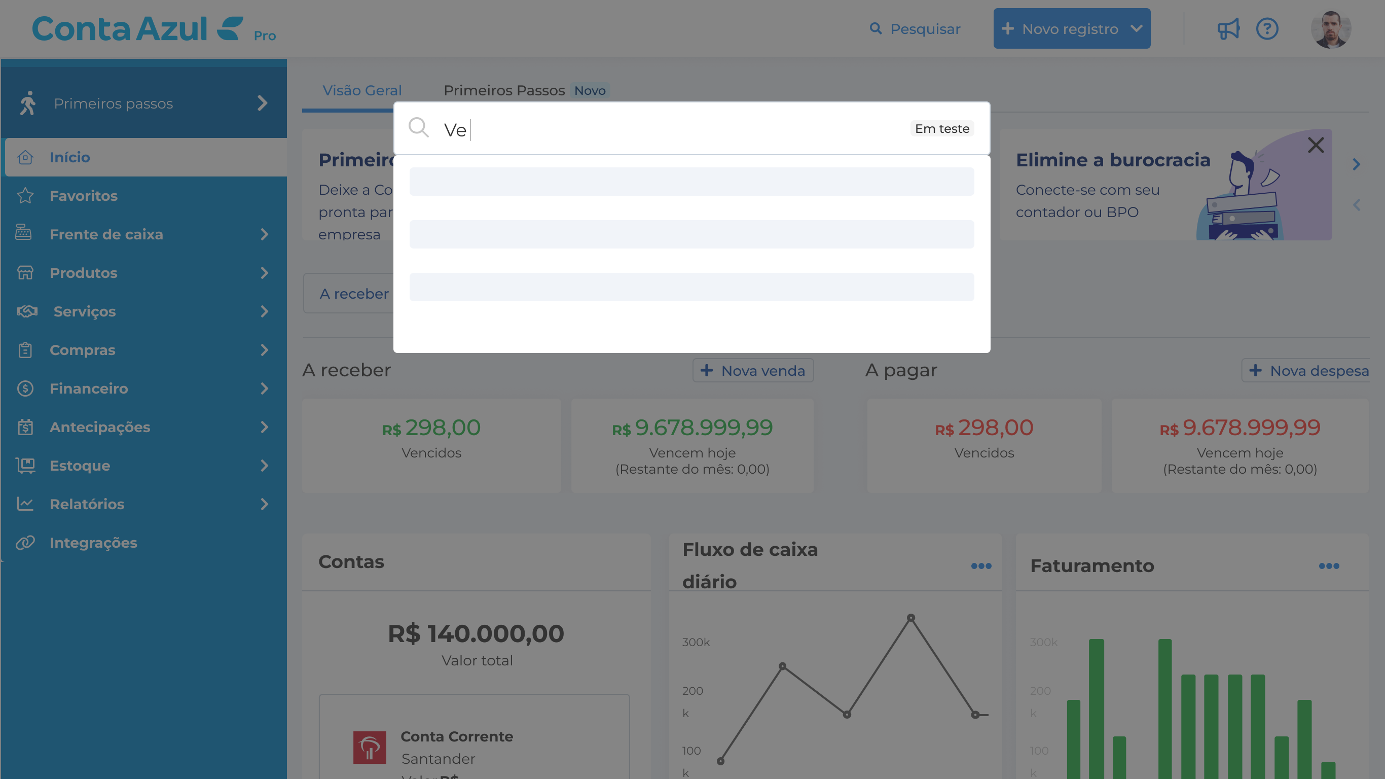
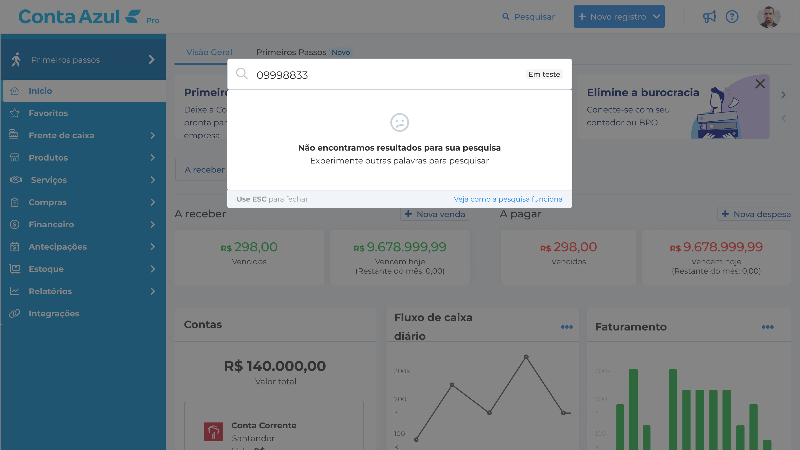
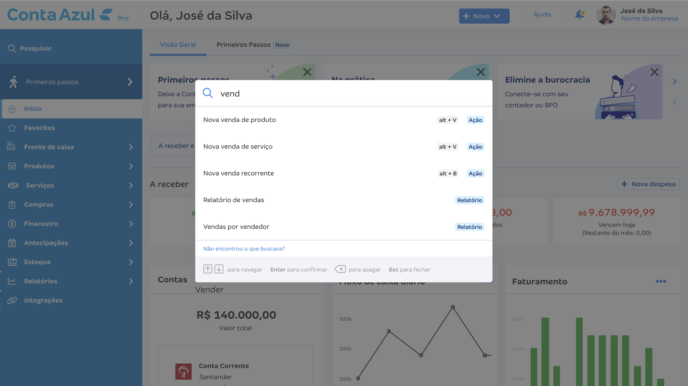
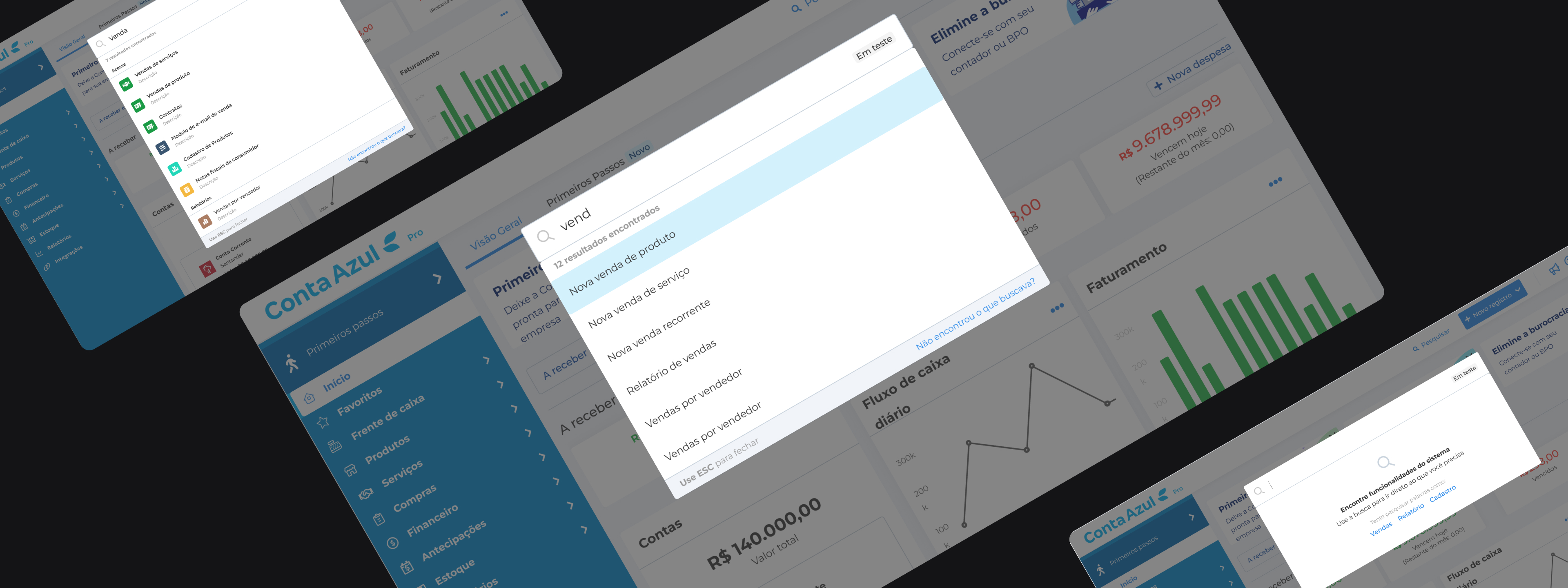
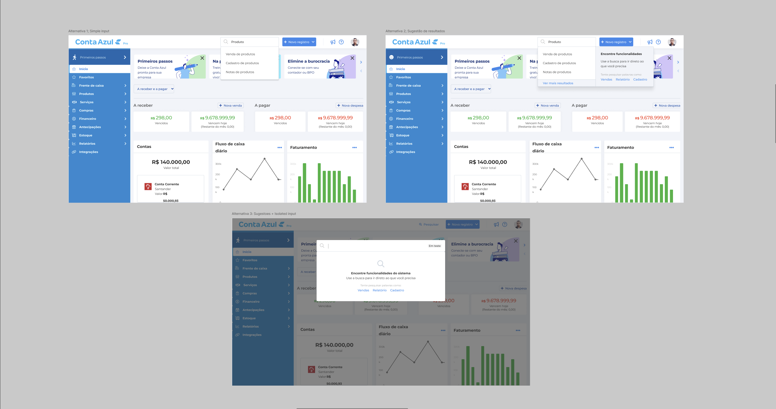
Design of a global search layer as an MVP: search for actions, features and entities within the product, with contextual results that respond to the user's intent instead of replicating the menu structure.
Result
Measurable effect on discovery of critical features: +600% in access to reconciled Pix, +233% in issued Pix, +100% in payment link, among others.

Results

  • +600% Reconciled Pix Search + navigation
  • +233% Issued Pix Search + navigation
  • +100% Payment link Search + navigation
  • +41% Purchases Search + navigation
  • +37% Sales reports Search + navigation

Role

I was the Product Designer responsible for the global search component and its integration as a navigation layer independent from the main menu. The work covered three fronts: architecture decisions on the initial indexing scope (product routes and URLs in the MVP), design of the component’s states, and coordination with Design System partners to incorporate the component into the DS. I led the interface decisions and the accessibility specification of the component, in coordination with the squad’s stakeholders.

Strategy

The activation data documented the problem with precision:

  • 69% of trials didn’t return on the second day.
  • Less than 10% performed essential actions (sales, billing, integrations) during the trial.
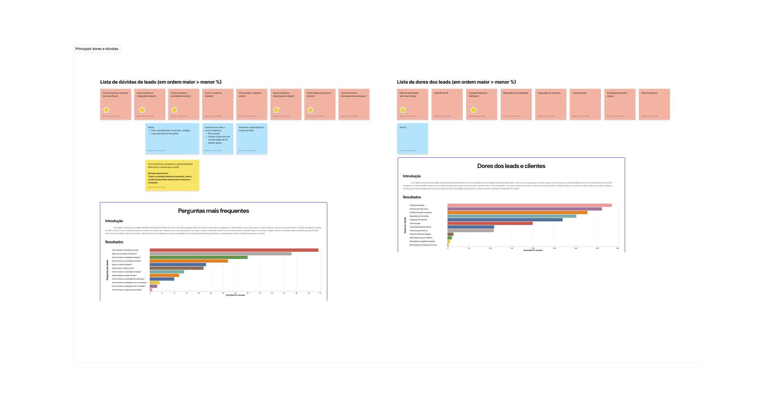
  • Meetrox, Feb/2025: 219 mentions of missing features, 130 of difficulty of use and 70 of unmet expectations.

These numbers pointed to two possible diagnoses: either the product didn’t deliver what the user needed, or the product delivered it but the user couldn’t find it. The second hypothesis had support in well-established UX principles: the Hick-Hyman Law establishes that decision time increases with the number of options available at once; the Miller Principle describes the limits of cognitive load in interfaces. A side menu that shows everything to everyone violates both.

The strategic decision was to treat low discoverability as the primary cause, not lack of functionality. The MVP was designed as a layer complementary to the menu, not a replacement: it keeps the existing structure for users who already know the product and creates a direct shortcut for those still learning it. Deliberately minimal scope: no autocomplete, no history, no personalization, to validate the usage pattern before investing in expansion.

Process

The process followed a deliberate sequence: activation data analysis → qualitative research with new customers → desk research and benchmarking → evaluation of component alternatives → specification of the isolated component.

Qualitative research with new customers was decisive in turning hypotheses into evidence. The reported problems were concrete: unlabeled icons in the collapsed menu (customers tried to memorize icons to navigate); divergent terms between the help center (“PDV”) and the system (“Frente de Caixa” / point of sale); imports capped at 500 records with no clear error messages; support chat with an average 30-minute wait.

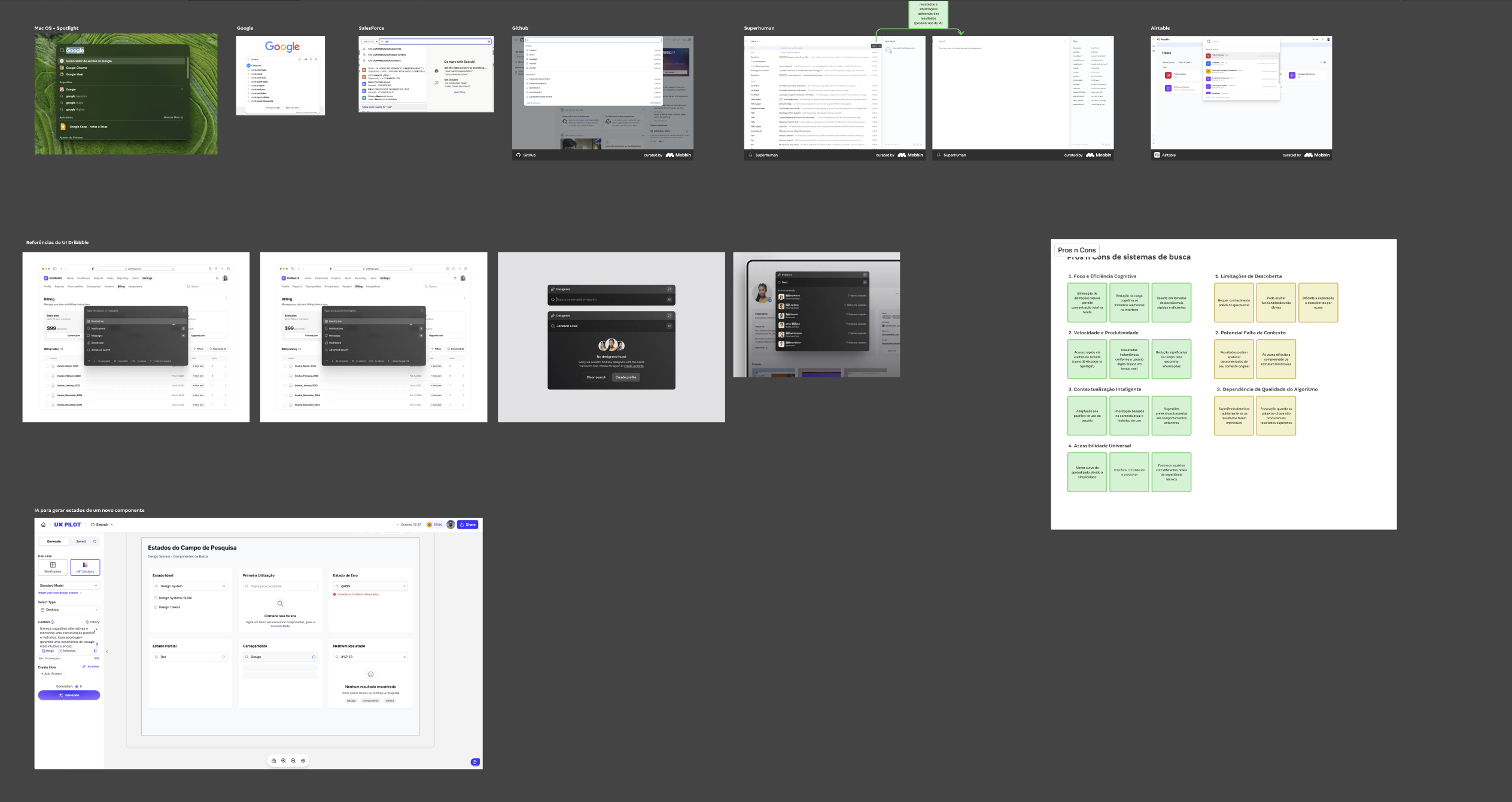
The benchmark covered twelve standalone search systems in SaaS: Spotlight Apple, Google Search, Sketch, Slack, Notion, Linear, GitHub, Superhuman, Airtable, Coda, Raycast and Alfred. Convergent traits observed: real-time search as you type, clear categorization by result type, keyboard-shortcut accessibility (⌘+K as the market standard), tolerance for typos, and contextual personalization.

Diagnosis

Solution

Reflection

What this project actually was

An investigation into repressed demand. The activation data showed low usage of valuable features, and the easy reading would have been to conclude users didn’t need them. Search told a different story: they needed them and couldn’t find them. The +600% in reconciled Pix unlocked a behavior that already existed as intent and never reached its destination, with no new feature involved.

At its core, it was proof of concept that information architecture moves product behavior, not just user satisfaction.

What remained afterward

The standalone search component was incorporated into Conta Azul’s Design System with a complete specification of states, accessibility criteria and reuse best practices. The future vision documented during the project (AI integration for smart suggestions, data-guided navigation, ordering by recent use, integration of help articles and training) was recorded as a strategic backlog. The existing component is the technical and design foundation for that expansion.

What I’d do differently

I’d instrument the component with event tracking from the MVP launch. Feature discovery numbers were measurable because other tracking systems were active, but there was no data specific to search usage itself: most-searched terms, click-through rate on results, frequency of the empty state. That data would have sped up the decision to expand the indexing scope and would have given a basis for prioritizing which entities to add first.

I’d also run qualitative research dedicated specifically to search behavior before defining the component’s states, not only after rollout. The research with new customers documented existing navigation blockers, but didn’t test mental search patterns: what users expect to find, how they phrase queries, the perceived cost of an empty result.

In a v2, I’d add visual categorization of results via iconography, signaling the nature of each item (action, feature or entity), and a short description on each result. Both changes make the click decision easier and reduce cognitive load in navigating and using the features.

Let's work together?

Available for full-time · remote · freelance

Open to new projects, opportunities and conversations.