Redesigning the subscription checkout to reverse a 62% abandonment rate
Conversion
Checkout
B2B SaaS
Hypothesis-Driven
Revenue
Context
Conta Azul's subscription checkout was the final point of the acquisition funnel, and it was losing 62% of users before payment completion.
Problem
62% abandonment rate, with direct impact on subscription revenue. The flow's design accumulated friction at multiple points with no clear hypotheses on where to prioritize.
Approach
Diagnosis by stage, prioritization by estimated impact, and execution of each improvement as a measurable hypothesis, before design. Full ownership from diagnosis to QA.
Result
+63.5% in checkout completion rate. Final rate of 71.04%, surpassing the original goal of reducing abandonment from 62% to 55%.
Results
+63.5%Checkout completionvs. baseline
71.04%Completion after changesTarget was 55%
−12.77%Billing-step abandonmentBiggest bottleneck
+14.5%Add-on step completionRepositioning
Role
I led this project as the sole designer responsible, with full scope: from analyzing stage-by-stage abandonment to delivering QA on the implementation. The work wasn’t just interface redesign: it was a conversion program structured around hypotheses documented in Confluence, each with a success metric defined before any wireframe.
The scope included abandonment data analysis by funnel stage, UX writing decisions, visual hierarchy adjustments, structural repositioning of the flow, and a business dilemma that had to be resolved before design: what to do with the trial-extension button.
Strategy
The core problem was a product problem before it was a UX problem. The trial-extension button served a legitimate case, but its position in the checkout created two problems: it competed with conversion at the moment of decision, and it left the sales team with no record of when to follow up. The decision was to reduce the extension button’s visual emphasis in favor of the plan buttons.
The second decision was to treat every improvement as a documented hypothesis, not a UX deliverable.
Goal: reduce abandonment from 62% to 55%; to get there in a trackable way, every intervention needed a recorded impact prediction before design.
Format: generated clarity about what was being bet on, and a learning base for what specifically worked.
Main CTA: decision anchored in Fitts’s Law: in a flow with high perceived cost, reducing the motor effort of the click is a conversion intervention, not polish.
Process
The diagnosis started from data, not perception. The funnel was mapped stage by stage with completion rates, to identify where the loss was greatest, not where the flow looked most problematic visually. From the abandonment map, alignment meetings with the team produced a collaborative survey of cause hypotheses. Each hypothesis was evaluated on two criteria: implementation feasibility and estimated impact on the final rate.
The result was a prioritized list of interventions, each with an explicit hypothesis and a success metric documented in Confluence. The hypothesis format was fixed: “if we do X, Y will happen because Z.” This format forced precision before design and created a base for learning after the result.
The designer’s workflow included QA of the implementation, not as a one-off review, but as part of the scope. Spelling errors on the payment step, validation bugs, and copy inconsistencies were identified and fixed during this phase.
Data-Driven
Collaboration
Prioritization
Hypothesis-Driven
Metrics-Driven
QA
Diagnosis
The funnel was mapped stage by stage to identify where the loss was greatest.
Question: What problems had the team already observed in the flow, and which had no documented cause hypothesis?
What was done: Alignment meetings with people involved in the conversion funnel to gather observations, support reports, and perceptions of user behavior. The survey was combined with a usability evaluation of the flow to identify friction that the abandonment data alone didn’t explain.
Key finding: The trial extension was competing with conversion at the same moment of decision, and there was no record of the event for the sales team. The button existed for a legitimate case, but its implementation created a silent loss of revenue.
Artifact: Prioritized list of improvement hypotheses, evaluated by feasibility and estimated impact.
Question: At which stage of the flow was the loss proportionally greatest, and what cause hypothesis explained the pattern?
What was done: Mapping of stage-by-stage completion rates from the available abandonment data. The reference period covered 2,404 checkouts started over 30 days, 629 of them originating from end-trial users. This segmentation exposed that the context of checkout entry influenced behavior in the flow.
Key finding: The billing step concentrated the largest volume of abandonment. The cause hypothesis combined three vectors: fields presented all at once with no progressive disclosure, premature validation that interrupted filling before completion, and lack of clarity about the final discounted value.
Artifact: Abandonment map by stage with cause hypotheses documented per item.
Question: Which sequence of interventions would maximize impact on the final rate within technical feasibility constraints?
What was done: Each hypothesis raised was evaluated on two dimensions: implementation feasibility (time, technical dependencies, engineering scope) and estimated impact on the final completion rate. Execution order also considered dependencies between stages: the add-on step could only be repositioned effectively once the billing bottleneck was resolved. For each approved item, a success metric was defined and documented in Confluence before design began.
Key finding: The billing step was the priority bottleneck: solving other points before it would produce limited gains, since the loss happened before the user reached the following steps.
Artifact: Backlog of prioritized hypotheses with metrics documented in Confluence, ready for sequential execution.
Solution
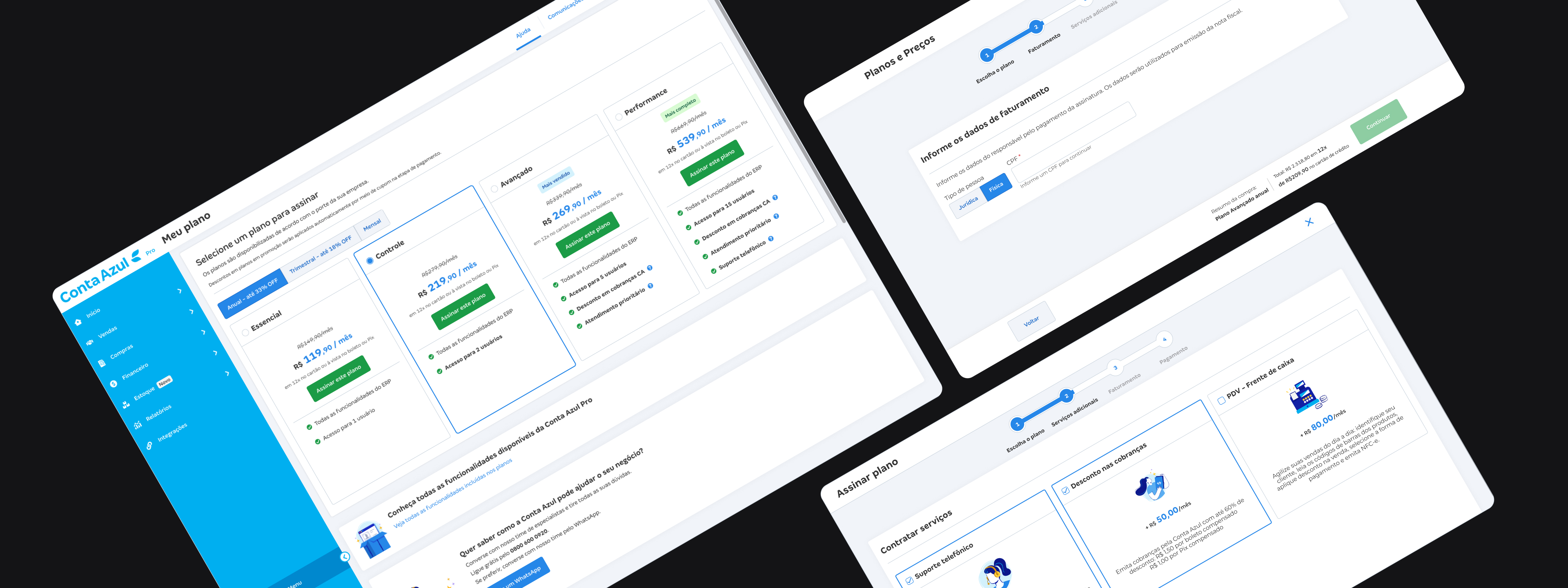
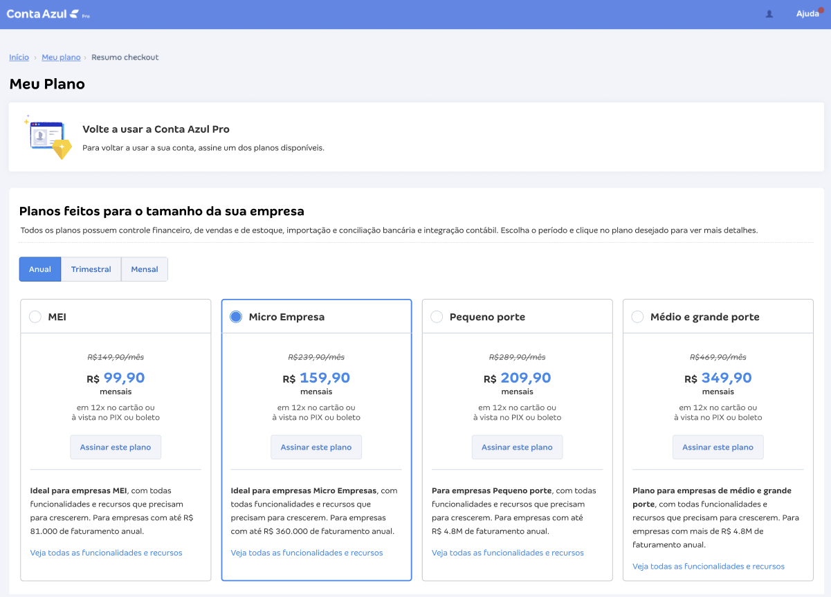
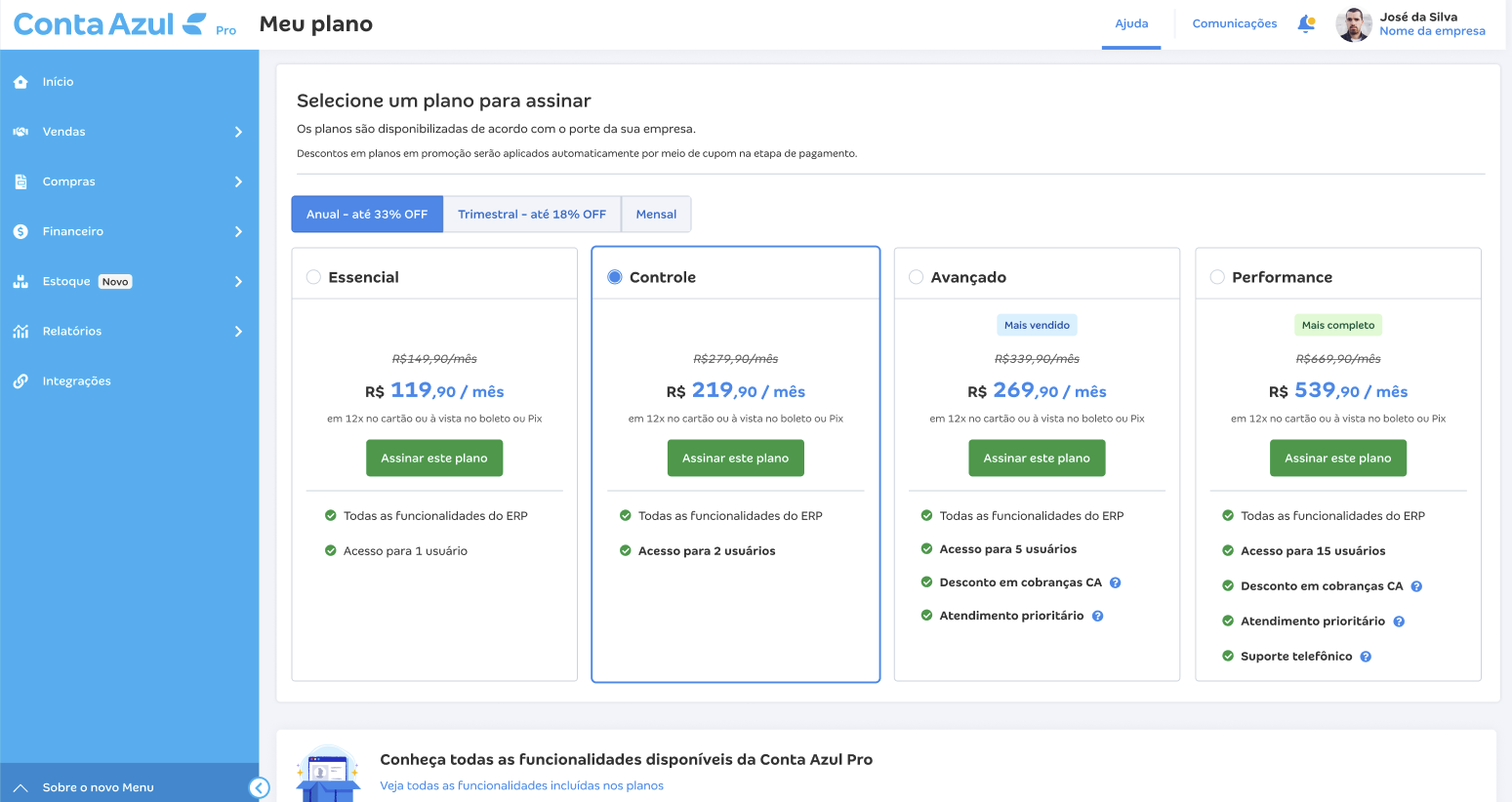
Problem: On the plan-selection screen, the trial-extension button competed visually with conversion, and there was no direct purchase CTA with enough visual weight. The extension served a legitimate case, but at the moment of decision it drained subscription intent and left no record for the sales team.
Design decision: Reduced the visual emphasis of the extension button and inserted direct purchase CTAs on the plans, shifting the weight of the main action toward the subscription. The extension action now generates an automated record, giving the sales team visibility into when to follow up.
Plans screen before — emphasis on trial extension
Result: Intervention measured by the volume of checkouts started: 2,404 total and 629 originating from end-trial over 30 days, the segmentation base used to calibrate the rest of the funnel.
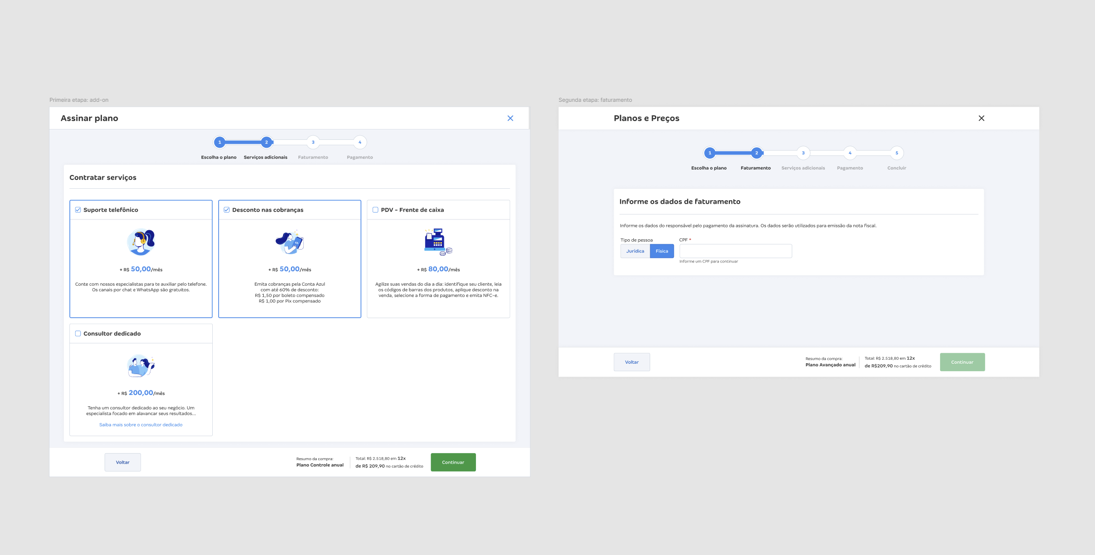
Problem: The add-on step was missing from the purchase-suggestion flow: the user was routed directly to Billing without passing through Add-on. Repositioning was needed both to measure real add-on adoption and to ensure it appeared at the right moment in the flow.
Design decision: Repositioned the step to after Billing, within the purchase-suggestion flow, ensuring the user had already confirmed the main plan before encountering the add-on decision. This sequence reduced the perception of a mandatory barrier before purchase and, for the first time, allowed measuring real add-on adoption in this context. The test required a technical Spike study with engineering before implementation, aligning feasibility and measurement instrumentation.
Add-on step repositioning within the purchase-suggestion flow
+14.5%Add-on step completion
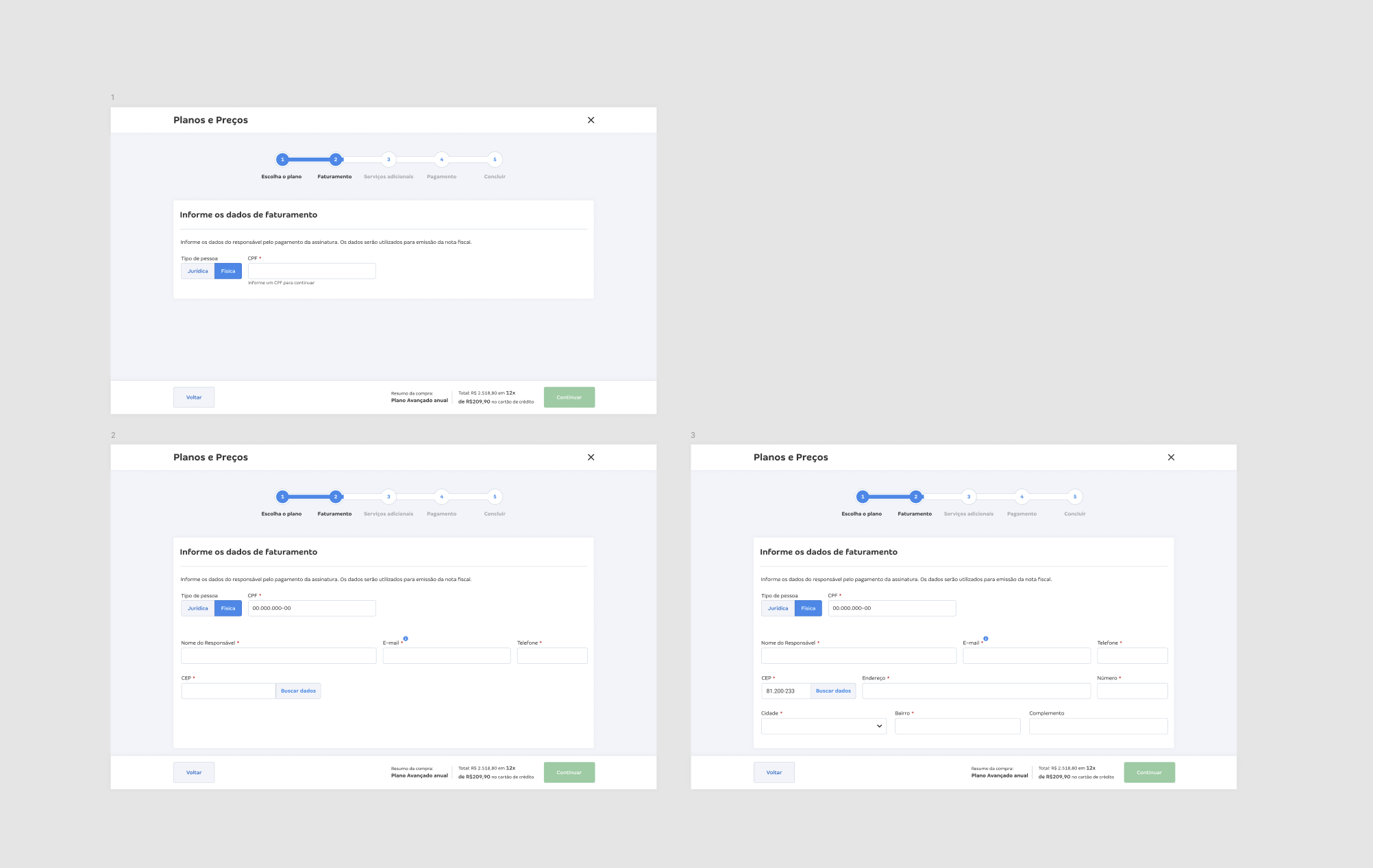
Problem: Highest abandonment rate in the flow. Billing fields presented all at once, with premature validation before the form was completed.
Design decision:
Progressive fields (individual taxpayer) — shows only what’s needed at each moment, reducing perceived cognitive load.
Fixed validation — errors appear only after interaction with the field, not before.
Billing fields — progressive disclosure and fixed validation
−12.77%Billing-step abandonmentBiggest bottleneck in the flow
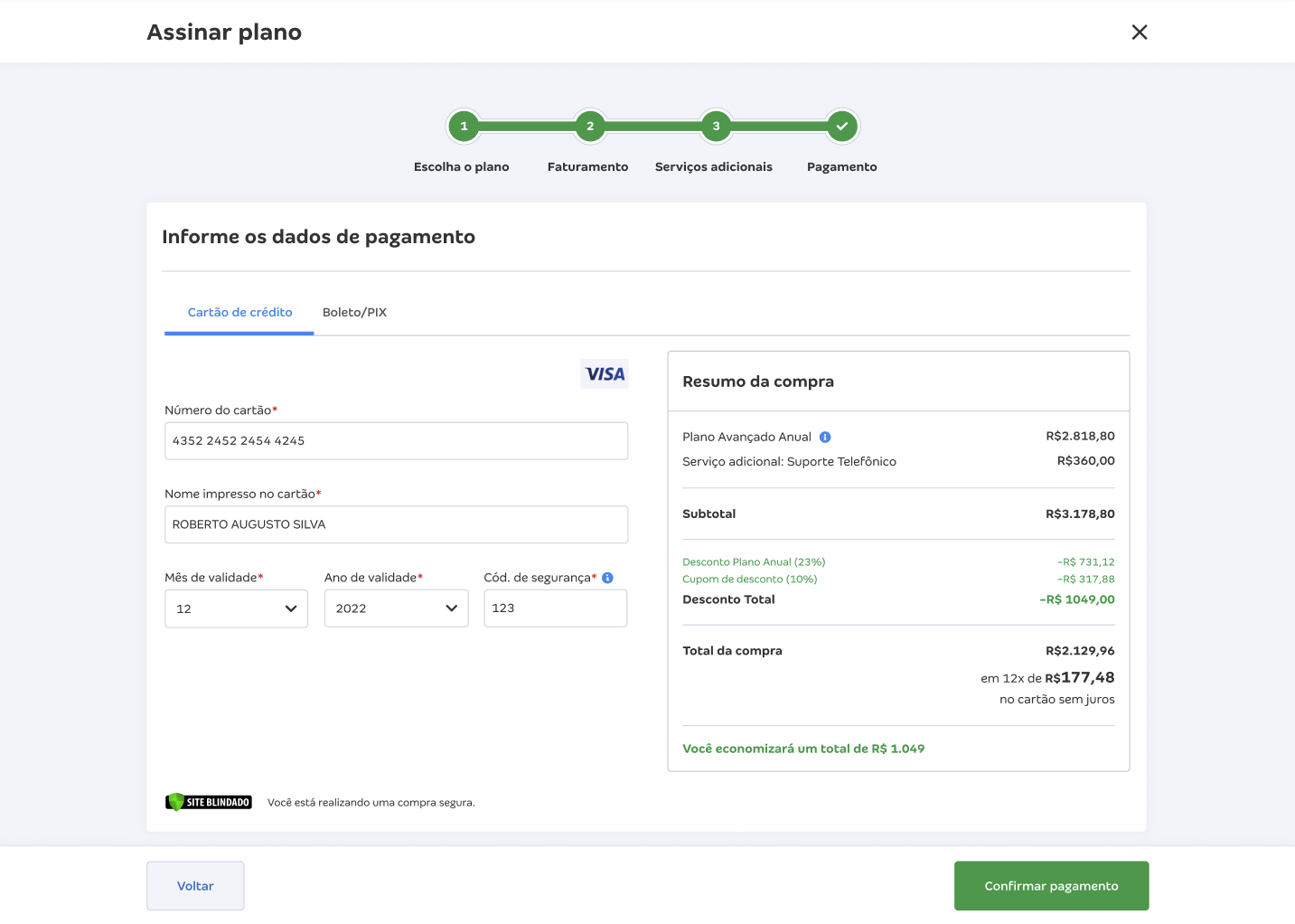
Problem: No trust signals at the most sensitive moment of the flow. Action buttons with insufficient click area for a high perceived-cost action. Copy for the boleto (Brazilian bank-slip payment) completion step created ambiguity about order status, with spelling errors on the step.
Design decision:
“Secure purchase” seal — in B2B, data security and cancellation policy are decision criteria, not generic reassurance.
Explicit discount in the summary — lack of clarity about the final value was a documented source of abandonment from uncertainty.
Larger buttons (Fitts’s Law) — target size has a direct relationship with interaction time; in a high perceived-cost action, reducing motor effort is a conversion intervention. Large component specified in partnership with the Design System team, via formal request.
Rewritten boleto copy — eliminated the implication of completion when payment still depended on an external action; spelling errors fixed.
Combined contribution from all steps · Boleto: tracked separately (issued vs. paid)
Reflection
What this project actually was
A conversion program run with hypothesis discipline. An ordinary redesign would have delivered a prettier checkout; here, every intervention became a documented bet before execution, and that generated learning about what actually moved the metric. The official goal was to bring abandonment down from 62% to 55%. Reaching 28.96% abandonment (71.04% completion) was a consequence of that method.
The trial-extension dilemma shows the line between a design decision and a product decision. The button served a legitimate case, but its position in the flow silently drained revenue and left no record for the sales team. Solving it required understanding the sales pipeline, not just checkout user behavior.
What remained afterward
The working pattern remained: hypothesis documented before design, success metric before execution, QA within the designer’s scope. Every delivery becomes data, and data is reused in the next decision. A delivery with no hypothesis behind it disappears without leaving any learning.
The 28.96% abandonment result places the product in the top quartile of the market. Optimized B2B SaaS checkout benchmarks indicate abandonment rates between 30–50% for well-executed flows; above 60% is an indicator of unresolved structural friction. Conta Azul’s checkout moved from the lower tail to surpass the reference range for optimized flows.
What I’d do differently
I’d start the diagnosis with behavior segmentation by entry context before the collaborative hypothesis survey. The 629 end-trial checkouts and the 2,404 total checkouts in the reference period had different motivations, and hypotheses calibrated by segment would have produced more precise interventions from the start, not as a later refinement.
I’d also document the decision on the trial-extension button as a recorded product decision, not just a visual-hierarchy adjustment. Decisions that affect the sales pipeline deserve formal traceability, regardless of where they appear in the interface.
Protected case
This case is password-protected. Enter the password to access the full process — or get in touch to request access.
Let's work together?
Available for full-time · remote · freelance
Open to new projects, opportunities and conversations.